Project overview

Redesign the flight search results within the existing search results page

The way we receive and display flight data is being changed due to updated airline contracts and distribution systems. This change prompted us to take a look into modernizing our results as a whole. This update would also include a much needed improvement to our mobile experience. Updating the filters would not be a part of this project.
My role

  • Product Designer

Team

  • Product Manager
  • Front-end Engineer
  • UX Designer

Tools

  • Figma
  • Useberry
  • Jira
  • Hotjar

The need for a redesign

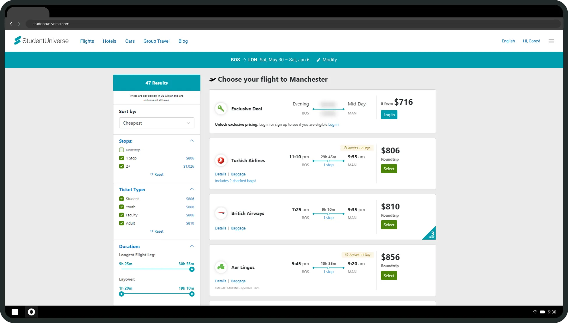
Only showing one cabin type

Student rates not called out

Hard to see our value

Mobile is not user-friendly or accessible

Amenities are not shown

Hard to compare to other sites

Marketing and promotions not shown

Old fare select
Curent search results (No access to mobile screens)

Solution

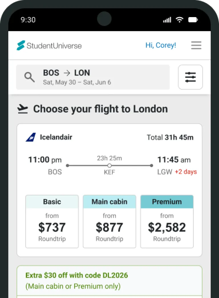
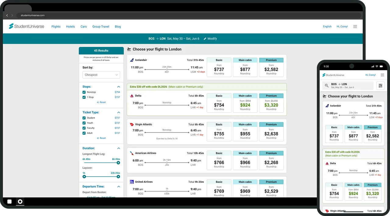
Flight search results

Comparing results

Itineraries

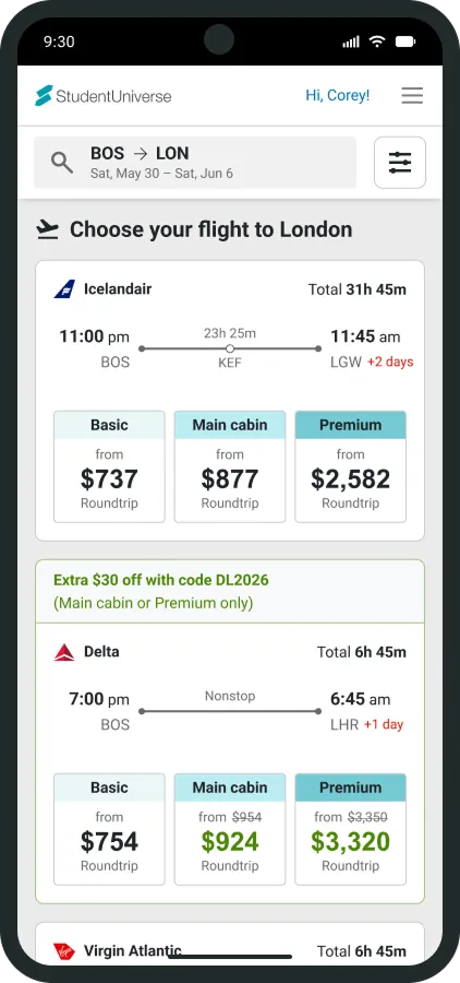
Stop locations are now exposed instead of behind a click.

Cabin types

Three categories of cabin types are now shown on a single result, resulting in easier comparison within a single itinerary.

Sales and promotions

Dynamic discounts and promos are shown within specific results instead of general placements. Savings are now reflected in the price shown.

Mobile improvements

A core goal of this redesign was to improve the mobile experience, including increased touch target sizing and mobile-specific interactions/behaviors. Mobile screens will be used for all examples moving forward.

Search results mobile
New search results

Exclusive pricing

Verify to view

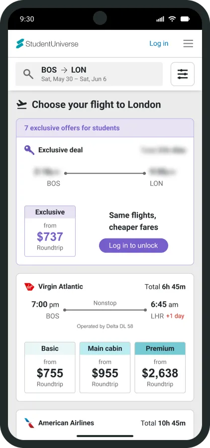
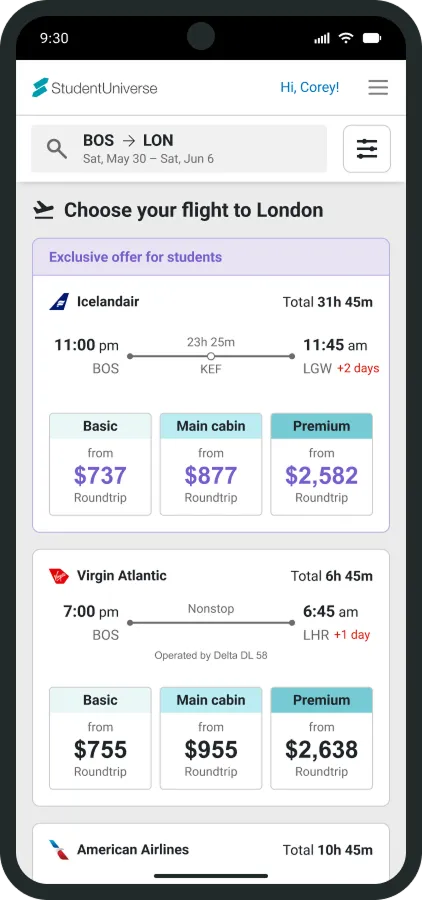
Our best deals are locked behind verified student accounts. Any results locked behind this are wrapped up into a single result. These results are shown individually once logged in with a banner and member-colored prices. Exclusive deals had previously been unclear on a per-result basis, as they didn't have anything calling them out.

Verify to view results logged out
Logged out
Verify to view results logged in
Logged in

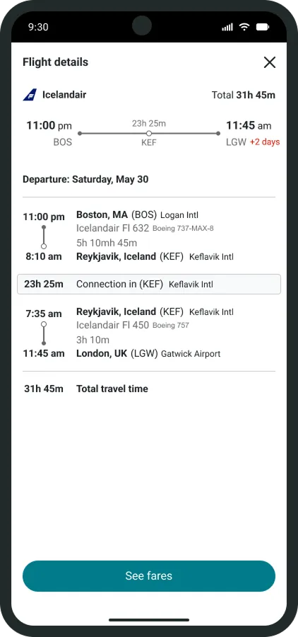
Flight details

Mobile-friendly

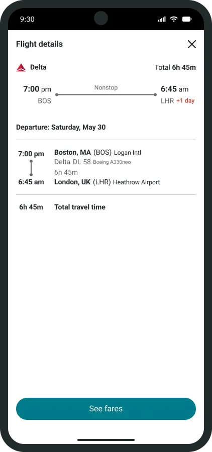
Flight details have been separated from fare selection and now show in a modal rather than expanding the result down vertically, often off screen. Because of the separation, the primary action is to move forward to fare select.

Itinerary mobile
One-way flight
Itinerary roudntrip mobile
Roundtrip flight

Fare select

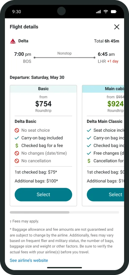
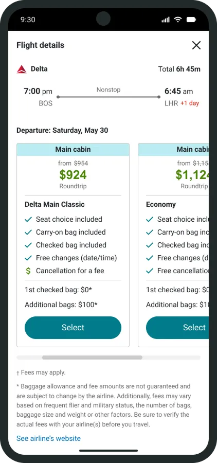
Multiple options per cabin

The cabin type clicked within the result is anchored to, but all cabin types are available along with their airline specific terminology for comparison with the airline and other sites.

Compare amenities

Included amenities are clearly shown with symbols, color, and language to convey availability across all cabin types.

Fare select mobile
Basic cabin type chosen
Fare select mobile
Main cabin type chosen

Results

Conversion and total bookings increased

Users who clicked through were ready to book.

Fewer abandoned carts

Visible pricing upfront meant fewer surprises at checkout.

Lower click-through rate, by design

Users weren't wasting time going back and forth to get the information they needed to make a decision.